The following article was originally published by Packaging Impressions. To read more of their content, subscribe to their newsletter, Packaging Impressions inBOX.
McDonald's is one of the most iconic brands in the world. Its golden arches and most beloved menu items can be found at restaurants around the globe. The classic red french fry box is arguably as easily recognizable as its golden arches. However, as Matt Sia, creative director at Pearlfisher, explained to BRAND United in an email, McDonald's wanted to redesign its other packaging to make it "a coherent part of the McDonald’s experience through a family of products that feel reflective of the brand today: modern, fresh, and playful."
To achieve this renewed packaging mission, McDonald's partnered with the brand design agency at the end of 2016 to embark on a multi-year redesign of its global packaging system. The redesign includes wraps, clamshells, and sleeves, with plans for a global rollout and adaptation for regional items.
"The packaging redesign is part of a broader brand evolution," Sia explained. "McDonald's is making many new changes to their experience – from smart kiosks to menu innovations – so it made sense for the global range of packaging to evolve alongside the brand. ... No matter the region or language, we wanted the packaging design to celebrate moments of joy while being immediate and universal."
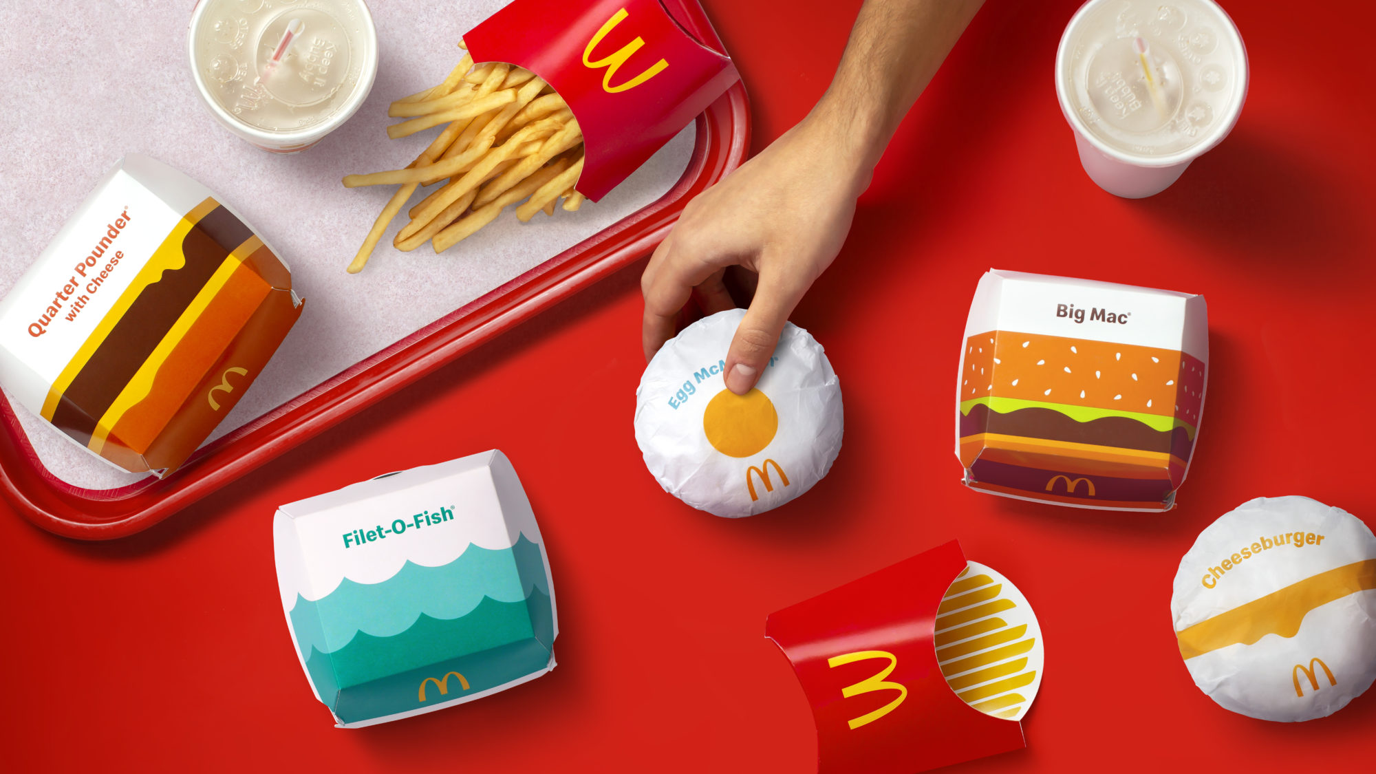
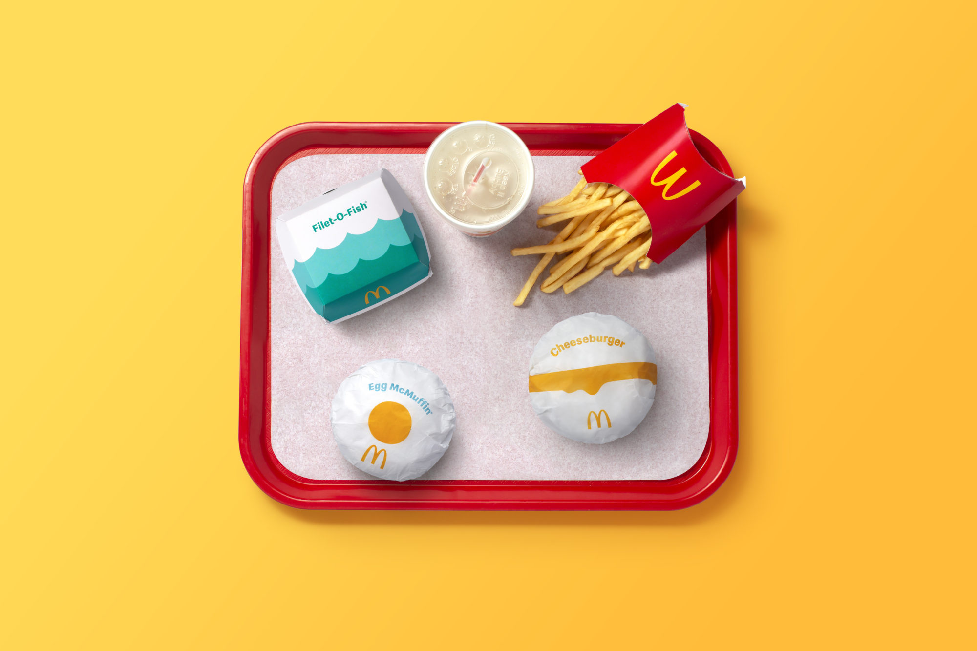
The new packaging features simple, colorful designs that reflect the corresponding menu item and make them immediately recognizable.

Credit: Pearlfisher
The redesign wasn't just developed to make the packaging more simple and colorful, though. It needed to be fun, flexible, and easy to identify by restaurant workers and consumers. It also needed to capture what makes McDonald's so celebrated and transition away from what a press release for the redesign describes as "prominent on-pack messaging." Sia wrote that the inspiration was to say "more with less."
"We were inspired to improve the customer experience by capturing the iconic nature of the brand," he explained. "Celebrating the essence of every menu item, was a major part of what we wanted to achieve with the redesign. This meant putting what’s special about the brand in the customers’ hands."

Credit: Pearlfisher
The resulting packaging is a cohesive system that Sia described as "aesthetically connected, functionally immediate, and emotionally uplifting." It was designed to be visually representative of the evolution of the McDonald's brand.
“We’re proud to debut this redesigned system,” said Barbara Yehling, senior director of global menu strategy at McDonald’s Corporation, in the press release. “Pearlfisher helped to ensure that this redesign modernizes our brand, highlights the specialness of our menu, and delivers on our commitment to quality.”

Ashley Roberts is the Managing Editor of the Printing & Packaging Group.


