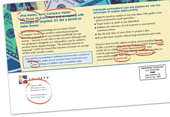
Fonts have personalities and convey different moods. A typeface or font matched to the personality or attributes of a specific individual or group can be the element that makes designs resonate with the viewer. Today’s variable printing technology makes it possible to match typography to audiences, but font usage in variable documents can be tricky. Fonts will display differently, depending on their attributes.
Font Considerations for Variable Documents
When designers create a variable project, they leave spaces in the documents into which the software will place the variable text. Since data files are not always available at design time, designers may guess at how much space to reserve for the variable data. Choosing too large a font for the data will cause unwanted line wraps or printing over static graphics or text. A too-small font results in odd-looking unused document spaces.
For mailed communications, printers must take care to use font sizes and styles that conform to US Postal Service standards for automated mail. Address block elements must fit inside the space for the label or envelope window.
When the same document template is used to display variable data rendered in different fonts, some compromises may be necessary. Even if the chosen fonts share the same point size, they will probably include variations in widths, weights, kerning, line spacing, and other attributes that affect how the variable elements fill the space reserved for them.
Consider a line of text with 30 characters that features an abundance of wide characters like W’s, em-dashes, or capital letters. It’s going to consume more space than a 30-character line populated by lots of narrow characters like lowercase i’s and l’s.
Data analysis prior to production will help to at least determine the longest and shortest number of characters to insert. Printers may suggest design adjustments or a change in font selection based on their data file assessments, but adjusting for all combinations of lengths and characters is probably impossible.
Variable size images will make predicting space for the variable text that surrounds them even more difficult. Designers should be encouraged to include consistently sized and shaped variable images and photos.
Why Bother?
If working with multiple fonts for variable text is more work, why would you want to run projects that use this technique? Well, it depends on the planned use of the printed pieces and the variability of the intended audience.
- If the data file includes senior citizens, it may improve readability to use larger, bolder type for them, but regular size fonts for everyone else.
- Referencing foreign names or locations for some individuals? You may need a font with specific characters not included in the reduced character set of some fonts.
- Printed pieces targeted to teenage girls may use one font to attract their attention, while fonts appealing to teenage boys are different. By varying the font dynamically according to the sex of the document recipient, printers can run the entire file as a single job.
- Specialty fonts may allow organizations to use the same document template to communicate messages in different seasons. Halloween-themed documents may look different from those produced during the Christmas holiday, for example, just by altering the font.
- Brands are sometimes identifiable by fonts. Postcards aimed at the alumni of different colleges, for example, may benefit from brand recognition by printing the messages in each institution’s preferred typeface.
Besides improving connections with readers, dynamic fonts for variable data can turn a job that would have required separate set-ups, tracking, and management into a single large job. This tactic improves productivity and efficiency while lowering production costs for print providers.
Typefaces are more complex than one might expect, especially when connected to variable data printing. Practice and planning will help you gain command over the intricacies of typeface usage and help you turn out more effective documents.
- Categories:
- Business Management - Industry Trends

In 2001, Roger Gimbel founded Gimbel & Associates, an international consulting firm providing business and market development services, skills training, and expert public speaking in the graphic communications and digital solutions industry. The mission of Gimbel & Associates is to help clients identify new business opportunities and implement leading-edge solutions using expertise in organizational development, technology selection, implementation, and work processes.
Roger oversees a team of Consultants with expertise in sales training, workflow analysis, MicroModeling, multichannel marketing, marketing plans, transactional printing, trans-promotional applications and creative strategies for mergers and acquisitions, business development workshops and seminars.


